 |
| -33.918386,151.227947http://tinyurl.com/thevitra |
Tuesday, November 2, 2010
Print and Interactive Posters
PRINT POSTERS
Click the images to open the high resolution version (1024x724)
INTERACTIVE POSTER
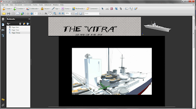
The Interactive PDF is hosted at FileFront. You can download the .zip file (30Mb) here.
INTERACTIVE POSTER
The Interactive PDF is hosted at FileFront. You can download the .zip file (30Mb) here.
Ultra-Low Poly LAYAR Modelling
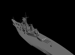
The image below is of the redrawn battleship, with a new hull and complete overhaul of decking and rigging. I noticed the V Ray renders lacked a little bit of definition, so I overlayed the lines from Sketchup in Photoshop by rendering out the profile of the scene using the Views option and removing the sky and ground. I was very pleased with the result and redid some of my previous renders to include the line overlay.
Final V Ray Renders
Again, I used the linework from the SketchUp render as an overlay to bring out the definition of the VRay renders. I think these look incredibly good and the detail is present as well as the quality... truly the best of both renders.
Monday, November 1, 2010
Poster Draft Layout (Rule of Thirds)
The images below display a quick mock up of 3 pages in landscape orientation for the poster. Photoshops guidelines are marked for the center and a 3x3 grid, with elements anchoring to the junctions of the gridlines.
Saturday, October 30, 2010
Wednesday, October 27, 2010
Animated water texture
Unfortunately, it doesn't animate in the blog, and until I get a video capture of it (Fraps is not cooperating with me) this will have to do. If I make it more than just a simple cube, it will actually have some 3D elements to it as well, which could look good, or just completely ruin everything.
UPDATE: Fraps decided to work for once. Video compressed for your convenience (350kb)
The first bit is enabling animation in the preview, under the View menu. This is important. Obviously.
Monday, October 25, 2010
Thursday, October 21, 2010
Animated textures in Layar
As of Layar 3.5, the textures applied to models can be animated to create simple looping elements or to animate environments. They can be either natively supported through GIF animation or by establishing an image sequence once exported to the Layar converter (only in the latest version).
To experiment with this, I created a water texture by simply offsetting my ocean tileable texture by 20% for 5 frames of seamless wave motion. It is important to remember the limitations of the devices processing the animations, and Layar recommend a maximum of 10 frames and all the images or frames must be 256x256 (512x512 is not recommended either). I found that compressing the images significantly improved the file size, another one of the qualms of the animation support. Knowing the temperamental nature of Layar, I kept as far under the bar as possible, and with just a simple animated cube managed to get some promising results.
The alpha channelling for transparency can also be incorporated into the animations... but I haven't attempted that just yet, but it could be very useful for creating the illusion of moving parts.
The alpha channelling for transparency can also be incorporated into the animations... but I haven't attempted that just yet, but it could be very useful for creating the illusion of moving parts.
Tuesday, October 19, 2010
New Poster Concepts
Previously I was thinking of something along the lines of a Naval propaganda poster or a military artwork for my poster set, however including the necessary information in these designs was detracting from their original appeal.
 |
| Click for larger image |
My new approach follows something similar to the encyclopedic cut away diagram. This will mean a lot more work for my high-resolution model, as the interior will need to be rendered at a high degree of detail as well. However, having looked at some of the posters (select few displayed above) created with this technique, and the animated components could work very well with such a design.
Friday, October 15, 2010
Vitra Comparison Renders
 |
| Rendered PhotoMerge |
 |
| Original Photograph |
 |
| Rendered Image Overelay |
I chose the black and white photograph sets as they were a more stylistic representation of the structure and correlated more closely with the geometry than some of the other shots. The postworking in photoshop allowed for matching of texture and colour from the original images, which was greatly beneficial.
Tuesday, October 12, 2010
Inspirations and Complications
The Vitra Design Museum is a building of very complicated geometric formation and structure. It is comprised of many different components, each modifications upon a conventional three dimensional primitive, with each component integrated into the structure with sweeping curvilinear forms and a fluid overall form. The streamlined elements of the roof structure, ramped stair and the rounded corners were much like the hull of watercraft.
The two angled structures of the overhang and triangular tower are similar to the bow and prow of a ship, and the line between the two cuts the structure in half nicely. While it lacks elements of symmetry, the shape and structure of a hull can be easily transposed such a line, and with some modification the structure itself can be further transformed.
The shape of a battleship features prominent tower structures for the bridge, gunmounts and control towers. The Vitra has several of these structures rising from the roof, notably the cross window, which can easily be seen as a battleship command bridge without too much imagination.
Sunday, October 10, 2010
Thursday, October 7, 2010
Frank Gehry Case Study: California Aerospace Museum
The Aerospace Museum at Exhibition Park, California, is one of Frank Gehry's early works, and one of his first museum commissions. The Aerospace Museum is part of the larger California Science Center, which includes several other structures by other architects. Even at this early stage, Gehry's work incorporated the distinctive style he adapted from previous residential projects, creating geometric shifts and irregular angular forms which break from the spacial bounding of the base structure.
The structure is segmented, comprising of a union of differentiated pieces brought together in a spacial collage of artistic style and architectural form. The Museum's exterior has the signature sculptural style that permeates Gehry's work, with the facade of the building an arrangement of intricate stylistic components: a large metal-skinned polygon, a glass wall with a windowed prism above it, and a stucco cube with a hangar door. Above this aircraft hangar door is an F-104 Lockheed Model G Starfighter Jet poised in mid-flight, jutting out from the structure as both artistic statement and . The purpose of the structure is reinforced through these materials, with the building itself as an abstraction of aircraft and their environment.
This notion of reflection is what makes the Aerospace Museum outstanding in the Gehry body of work, the building itself is an exploration of what the museum contains, an example of the power of purposeful architecture, which Gehry blends so effectively with abstract sculptural forms.
The interior of the Museum is as dynamic as its exterior, designed to give patrons an uninhibited experience of the museum, with the freedom to explore in a non-linear fashion through the buildings circulatory system of ramps, flanking stairs and platforms that bring viewers through the museum at multiple elevations, around the suspended aircraft on display. The use of skylights is a necessity for the illumination of the interior spaces, however Gehry again takes a unique approach to these elements, incorporating them into walls, angling and rotating them to become architectural elements within themselves, rather than simply utilities.
REFERENCES
http://www.bluffton.edu/~sullivanm/aero/aero.html, Mary Ann Sullivan
http://www.pritzkerprize.com/laureates/1989/works02.html, Michael Moran
Aerospace Hall, California Science Center, Los Angeles 1982-84. “Frank Gehry, Architect.” J Fiona Ragheb, ed. New York: Guggenheim Museum Publications, 2001: 61.
Monday, October 4, 2010
The Bismark
For the purpose of rendering my high resolution images for use on the A1 posters, I have chosen to base my model off the German battleship Bismark. I have downloaded a model from the Google Warehouse to serve as a reference and foundation for my modification and LAYAR model.
Friday, October 1, 2010
Subscribe to:
Comments (Atom)


